From Photoshop 7 to AI: Nearly Twenty Years of Web Design

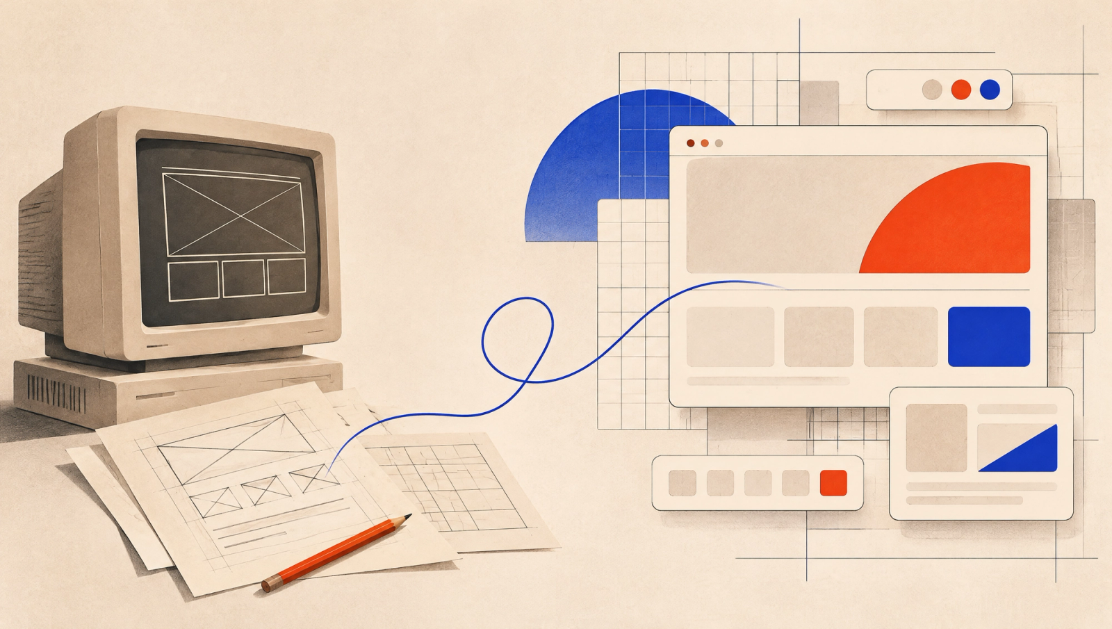
I think we were the lucky generation of web designers. We had the luxury of being terrible at it, slowly.
The first time my friends and I entered a web-design competition at a college tech fest, we managed to put together an HTML page with a few lines of text. That's it. No clever interactions, no beautiful layout. Calling it a website was probably an act of generosity by the judges. The second time, we had colours. A little later, some CSS. Eventually we even got JavaScript to do something useful. We must have attended tens of these events, learning one new thing at a time.
Today, in 2026, I can sit down with an AI agent, explain what I want, and get three or four working website designs without opening Figma at all. Something that took us years to learn is now available to someone in their first afternoon. Wonderful, right? It is. It's also a little terrifying.
Because if an AI can operate the tools and build the first version, what exactly does a designer need to be good at anymore? I've been thinking about that a lot. And to explain why, I need to go back nearly twenty years.
A quick timeline, before I get lost in the nostalgia
I don't remember the exact year of every software switch, so this is a timeline of my experience, not a history of product launch dates. Some applications overlapped. Some arrived long before I got around to using them.
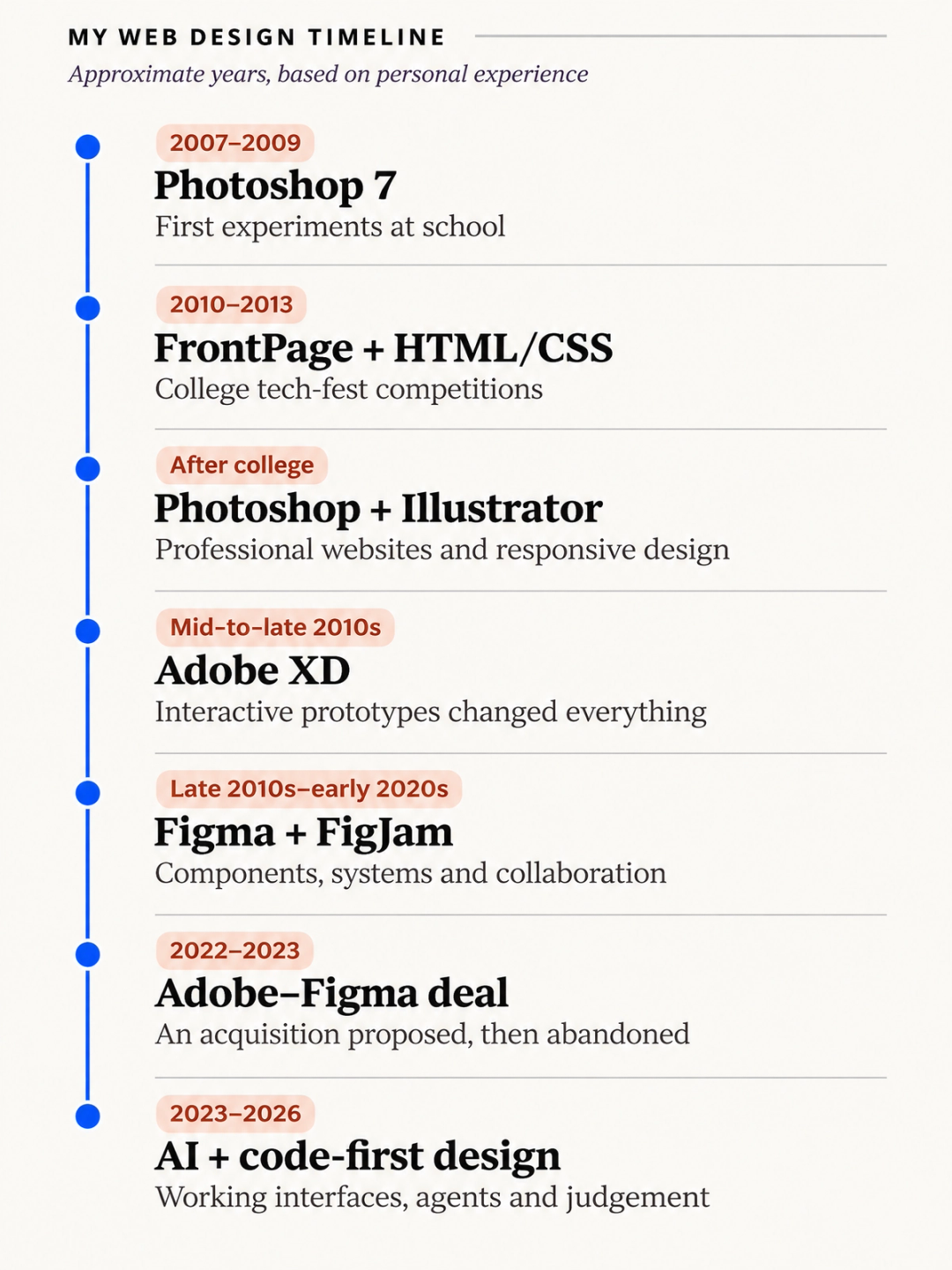
2007–2013: When adding colour was an achievement
I got my hands on Photoshop 7 when I was still in school, probably around 2007 or 2008. I remember the interface feeling understandable. There weren't a million things fighting for my attention, and you could figure out plenty just by clicking around. I didn't have a grand plan to become a designer. I liked making things and seeing what happened when I tried something new.
By college, my friends and I were trying to build websites. We used basic HTML, CSS and JavaScript, and a visual editor I remember as Microsoft FrontPage, or something very close to it. I still can't swear which exact application it was. That's probably the most accurate thing I can say about software I used fifteen years ago.
The tech-fest competitions were where it got interesting. Every time we went, we discovered ten things we didn't know. We'd come home, learn a few, and try another competition. We weren't searching for 'the best UI/UX course'. In fact, I don't even remember UI/UX being a job title in our circle. There was web design. There was web development. And there was the mildly humiliating experience of realising another college knew about CSS while you had proudly brought plain HTML.
Looking back, the slow pace was a gift. We could spend months understanding one small part of web design before the next big thing appeared. Nobody was asking us why we hadn't already mastered five AI tools that launched on Tuesday.
After college: We designed websites that weren't actually websites
Once we started doing professional projects, Photoshop became our main design tool. We'd create a beautiful desktop layout, get it approved, and then build it again in HTML and CSS. Illustrator came in for some vector work, but Photoshop remained the centre of everything.
Responsive design was becoming a big thing. We'd often create one desktop design and, sometimes, a mobile version. On projects without a proper mobile mock-up, we'd look at the desktop page and decide what to cut, stack or shrink until it worked on a phone. Responsive design sometimes meant creatively deleting things. It wasn't ideal, but that's the way a lot of us learned.
Prototyping was even more entertaining. If we wanted to show a client how a button would lead to another page, we'd export Photoshop screens as PDFs, put invisible hyperlink boxes over the buttons, and link those boxes to the right pages. A website prototype held together with PDF tricks. If that sounds ridiculous, it was. But when it worked, we were delighted.
And that's the funny thing about those years. A large part of 'designing a website' meant making a picture of a website and then explaining how the real website would work. We had to ask clients to imagine the whole experience. The design and the thing people actually used were two separate worlds.
Sketch passed us by. Adobe XD felt like magic.
Sketch became popular somewhere along that journey. We knew designers were talking about it, but it was a Mac application, and none of us had MacBooks. So that was the end of our Sketch exploration. The future of design had arrived, apparently, but it needed a laptop we didn't own.
Then Adobe XD came along, and I was one of its early users. We already had an Adobe All Apps subscription, so it was easy to bring it into our professional work. I loved the interface. It felt like there were barely three tabs, a handful of buttons, and almost nothing to get lost in. XD had plenty of problems and missing features, but you understood what the product wanted you to do.
And then there was prototyping. You drew a button, linked it to another screen, clicked it, and it went there. No invisible PDF boxes. No explanation of what was supposed to happen. It just happened. For me, it genuinely felt like magic.
We became strong, vocal advocates for XD. We designed multiple projects in it and used it for years. Every time Adobe shipped a feature, it felt great because we could immediately see the problem it solved. The software was growing with us. It was also relatively easy to sell to clients: we had an Adobe subscription, we knew the workflow, and everything felt suitably professional.
For accuracy, XD's early public preview arrived in 2016, and Adobe introduced a free Starter plan in 2018. My own experience was through our paid Creative Cloud setup. I wasn't keeping score of every pricing change then. I was busy being impressed that clicking a prototype button could actually take you somewhere.
Then this browser tab called Figma started annoying me
When Figma started getting attention, I wasn't enthusiastic. A proper design application in the browser? I had serious doubts about what a browser could handle. I tried it a little, and honestly, XD felt lighter and more polished. Figma felt slow to me. I went back to the familiar thing.
But outside our office, the community was exploding. Freelancers, independent designers and small studios were sharing Figma files, components, plugins and tricks. The free tier mattered. I remember people working around the three-file limit, archiving or cleaning things out when they finished a job, then starting the next one. You could be a designer with a laptop, a browser and very little money and still participate.
I don't think many people in those smaller communities had an expensive paid setup. Figma felt like the indie alternative to Adobe, and those people were a big part of what made it popular.
Meanwhile Figma kept adding features I wished XD had. Eventually we ran into one project where we specifically needed those capabilities. We'd already created the first version in XD. We moved it to Figma, finished the project there, and... we never went back. Not a dramatic, strategic migration. One client project changed the entire workflow.
I still have old XD files backed up on my PC. I don't know whether all the cloud versions are still there. I doubt I'll ever open most of them again. Somewhere on that hard drive is an archaeological dig of my design career.
I really did love Figma
Once I got used to it, Figma became my go-to application. I liked that it had a desktop app, even if the whole browser-based idea had initially put me off. I began doing things in Figma that I would previously have opened Illustrator for, simply because it felt faster.
And the features were excellent. Components, variants, design systems, tokens, variables, reusable styles, FigJam. When you were designing a serious product, those things made a difference. A properly structured Figma file wasn't just a pretty picture. It was a system that another person could understand and build from.
Developers loved the handoff too, at least when the designers had organised things properly. You could inspect spacing, styles and properties, see the system underneath, and copy useful code snippets even before AI coding became normal. We used FigJam for people in the team who weren't designers. We followed Config events to see what Dylan Field would announce next. I'd watch those releases and think, 'Yes, that's actually useful.'
I'm stressing this because I don't want to rewrite history just because I'm now questioning the tool. Figma wasn't some horrible software we tolerated. We were fans. We paid for it, recommended it and built plenty of client work around it.
Then Figma tried to marry Adobe. That was awkward.
I think the proposed Adobe acquisition was the first time my outlook on Figma really changed. The design community had embraced Figma partly because it wasn't Adobe. Now the alternative was preparing to become part of the thing people wanted an alternative to.
And the funny thing is, we were paying Adobe customers ourselves. We used Photoshop, Illustrator and the rest. But liking a product and liking the company behind it are very different things. Adobe's pricing, subscriptions and cancellation policies had already made it easy to be annoyed with the company.
So let's be clear about my loyalties here: fuck Adobe. Fuck Figma too, if it comes to that. I'm not joining a fan club for either company. They're businesses. They can build fantastic tools, and I can appreciate those tools, but let's not pretend they're charities whose primary mission is to make independent designers happy. They're trying to make money. My job is to make good work, not defend their quarterly results on the internet.
Adobe announced the proposed Figma acquisition in September 2022, and the deal was abandoned in December 2023. It never went through. But the episode still made me look at Figma differently.
Around the same broad period, the pricing became something we had to think about more carefully. Different seat types, FigJam access, design versus development needs, bundled options. Some of it helped. Some of it was harder to justify as a small agency. When you spend more time working out which colleague needs which seat than explaining a design decision, it's perhaps time to question the subscription.
None of this means Figma has stopped being useful, or that its free plan disappeared. It hasn't. What I felt changing was the centre of gravity. The more complex the projects and teams became, the more Figma's systems and controls made sense. The tool that won over freelancers was increasingly brilliant at serving large organisations.
And just as we got comfortable, AI walked into the room
For years the workflow was straightforward: design in one application, hand the design to developers, then build the actual interface. Figma made that handoff much better than Photoshop ever could. We had finally made the bridge between those two worlds pretty seamless.
Then AI started making the bridge optional for some projects.
Today I can talk to a coding agent about a web page, ask it for several approaches, open those approaches in a browser, and keep editing the working HTML, CSS and components. The result isn't an image of a website. It's already the beginning of the website. For a small brand site, a landing page or a quick experiment, why do I need to draw it twice?
We are increasingly trying this at TouchCraft. Rather than putting every idea into a separate cloud design file first, we can work directly with code on our own computers, use GitHub to share changes, and maintain components and design tokens as part of the actual product. I like owning the files. I like knowing I can open them with whatever tools I want tomorrow.
I might use Claude for one part of a project, another model for repetitive work, and a different agent when it offers a better result. The important skill is becoming the ability to communicate, review, direct and combine those capabilities. I'm not particularly interested in being trapped by one provider's idea of how a designer should work.
Does that mean Figma is dead? Of course not. Nor does generating three nice screens mean you've built a production-ready product. A working UI still needs accessibility, responsiveness, edge cases, performance, testing and proper engineering. Large teams also need a common place to agree on the work. I'm not throwing those things away because an AI demo made a nice dashboard.
But for the first time in a long time, the design application doesn't always have to sit in the middle. That changes the economics of these tools, and it changes what a designer spends time doing.
The really scary part? Trying to learn design today.
Here's the part I keep coming back to. We were lucky to have a slow beginning. From learning basic HTML to professional Photoshop layouts, then XD and finally Figma, every transition gave us time to learn. We could spend years in one workflow, understand what worked, make mistakes, correct them, and only then discover the next tool.
If you're entering design in late 2026, what do you even learn first? Figma? HTML and CSS? A design system? Prompting? Claude Code? One of the AI-first canvas tools that appeared five minutes ago? By the time somebody finishes a course on a tool, there might be an entirely new category of tools to learn.
And this isn't just Figma versus some new product. There's Penpot, which I tried and found painfully slow and buggy in our team's experience. There is Paper, which I'm interested in but haven't properly tried yet. There is Google Stitch and a growing collection of AI-assisted approaches. Figma has Make and Sites. Other models and agents are entering the workflow all the time.
I don't know which of these will matter in two years. Neither does the person confidently posting 'Figma is dead' on X, nor the person replying 'No it isn't, I made 47 components yesterday'. Both may be right for their own work. The landscape is changing faster than the arguments about it.
I genuinely feel for someone trying to choose a career path through all this. But I also think we've been asking the wrong first question. Instead of 'Which application should I master?', perhaps it's time to ask 'What actually makes someone good at designing something for another person?'
The answer isn't a better prompt. It's taste and judgement.
When I say taste, I don't just mean knowing whether something looks beautiful. I mean knowing what looks right, for whom, and why. The finer things. Where to put something, when to leave it out, which information comes first, and whether a person using the product will understand what to do next.
AI is already excellent at generating plausible-looking work. Ask for a modern dashboard and it will produce cards, charts and a sidebar that look like every other modern dashboard on the internet. The output might be polished. But who decided a dashboard was even the right answer? Does that customer need another graph, or do they need one clear action?
There is a huge advantage in knowing what's possible. Should the design be flat and 2D? Three-dimensional? Glassy? Pixelated? Retro? Editorial? Minimal? It helps to have seen different visual languages and understand what they communicate. But then comes the difficult part: just because you can make something look retro doesn't mean you should.
I might tell you that a retro effect is completely wrong for a corporate website. Then, after understanding the brand and its audience, I might decide it's exactly what would make that same corporate website interesting. That's not inconsistency. It's design judgement. The context changes the answer.
Attention to detail becomes more important when AI makes a convincing first draft cheap. A wrong hierarchy, a difficult mobile interaction, poor contrast, an inaccessible control, unnecessary steps in checkout, an empty state nobody considered. Those things can be the difference between a nice screenshot and a useful product. The last layer of quality isn't a filter you switch on.
The tools can increasingly make the thing. I still have to decide whether it's the right thing to make.
This is what I would ask young designers to work on. Learn how to communicate with agents, absolutely. Learn enough code to understand what is being built. Explore tools. But spend just as much time looking closely at interfaces, learning the history of design, understanding different styles, watching how real people use products, and asking why one solution is better than another.
The important skills now are the ones you build through knowledge, failures, observation and experience. Not just the muscle memory of where a particular button lives in the latest interface.
There is still a person on the other side of the website
The thing I don't want lost in all the excitement about AI is the user. You can give a model a detailed prompt, plenty of context and access to various tools. But it doesn't automatically know the actual people who will use the product, how they think, what confuses them or what the business is really trying to solve.
We have to find that out. We have to speak to people, understand the business, judge what matters, look at what users value first, and sometimes tell a client that the impressive design idea isn't the right one. AI can help with research and testing, but it needs genuine information. And someone has to be willing to make the call.
So if you want to experiment with a website idea, I'm all for using AI and getting something up quickly. I do it myself. But if you're building a serious website or product that your business depends on, please don't confuse a fast first draft with experienced design work.
What we build at TouchCraft comes from years of working on projects, seeing successes and failures, noticing what users respond to and learning where the small details matter. The value isn't that somebody on the team can open Figma faster than an AI agent. It's that we can look at a design and say, 'This will confuse your customer', 'This doesn't support the business', or 'This is the part you need to get right first.'
Those decisions are often less exciting to show on social media than a prompt that generates a stunning UI in thirty seconds. They are also the difference between a nice experiment and something genuinely useful.
So what happens to Figma? And to all the other tools?
I have no idea, and I don't think anyone can tell you with confidence.
Figma might be better off concentrating on enterprise teams for the next two or three years. There is real value in shared systems, team permissions, governance, standardised components and an agreed handoff process. Big organisations cannot change the way thousands of people work every time a new AI tool gets popular. The same reason people complain about enterprise software is often the reason enterprises keep paying for it.
For our larger client projects, Figma still makes sense. For smaller jobs, we might go straight into HTML, keep the design system in code and collaborate through GitHub. Maybe Paper becomes part of that workflow. Maybe Penpot becomes better. Maybe Figma changes the game again. There is nothing I can say for certain about what this industry will look like in another three years.
I also don't think Figma necessarily has to return to being the indie darling it once was. Maybe chasing bigger teams is the sensible business move now. But every software company needs to think about what people are really paying for when using the basic canvas becomes less of a differentiator. A tool is still a tool. It's the intelligence, collaboration, reliability and actual work done through it that matter.
Back to that terrible HTML page
Nearly twenty years ago, I walked into a college competition with a few lines of HTML. We didn't know much, and we had plenty of time to learn. Then came Photoshop layouts, Illustrator, responsive design, clickable PDFs, Adobe XD, Figma, components, design systems and now AI agents that can put working interfaces in front of us almost immediately.
I'm glad I went through all of it. Not because every software package made me a better designer automatically, but because every project gave me more chances to see what worked, what didn't, what people understood and what they found frustrating.
If I had to start again today, I would probably feel overwhelmed. There are too many tools, too many new releases, too many people shouting that the thing you learned last month is already dead. But I'd try to remember what those college competitions taught me: make something, watch what happens, learn why it worked or failed, and get a little better.
The tools will change again. Probably before I've finished getting comfortable with the ones I'm using now. That's fine. I never got into web design because I was in love with a particular toolbar. I got into it because I liked turning an idea into something people could actually use.
And after almost twenty years, I think that's still the interesting part.
Found this useful? Pass it on.