Equity Intelligence India
The rebranding of Equity Intelligence India was aimed at integrating the cultural heritage of Kerala into a modern financial identity, blending tradition with a forward-looking approach. This helped create a nationally appealing brand that resonated with both local and national investors.

Equity Intelligence India, led by renowned investor Porinju Veliyath, is a leader in value investing with deep connections to Kerala. The company wanted a brand identity that honored Kerala's rich cultural heritage while appealing to investors across India, balancing its local roots with national aspirations.
The project required rebranding Equity Intelligence to reflect its Kerala heritage while creating a modern, appealing identity for national investors. The target audience was both local Kerala-based investors and national stakeholders, with the goal of integrating Kerala’s cultural essence into the firm's modern image,
TCD roles can be summed up as follows.
The main challenge was blending Equity Intelligence’s Kerala roots with a sophisticated, modern brand that would resonate with investors both locally and nationally. The challenge was to preserve the firm’s traditional values while creating a fresh, forward-thinking image.
Outlining the strategic plan and methodology used to tackle the client's challenges. This section highlights our process for research, analysis, and planning to ensure a solution that aligns with client goals.
To tackle this challenge, we started by deeply researching Kerala’s rich culture and symbols that resonate with wealth and long-term growth. Our approach focused on using Kerala’s iconic elements, such as the backwaters and Kalari Payattu, to represent the adaptability and strategic vision of the firm. We developed a visual identity that would convey a sense of trust, endurance, and stability while maintaining a modern aesthetic.
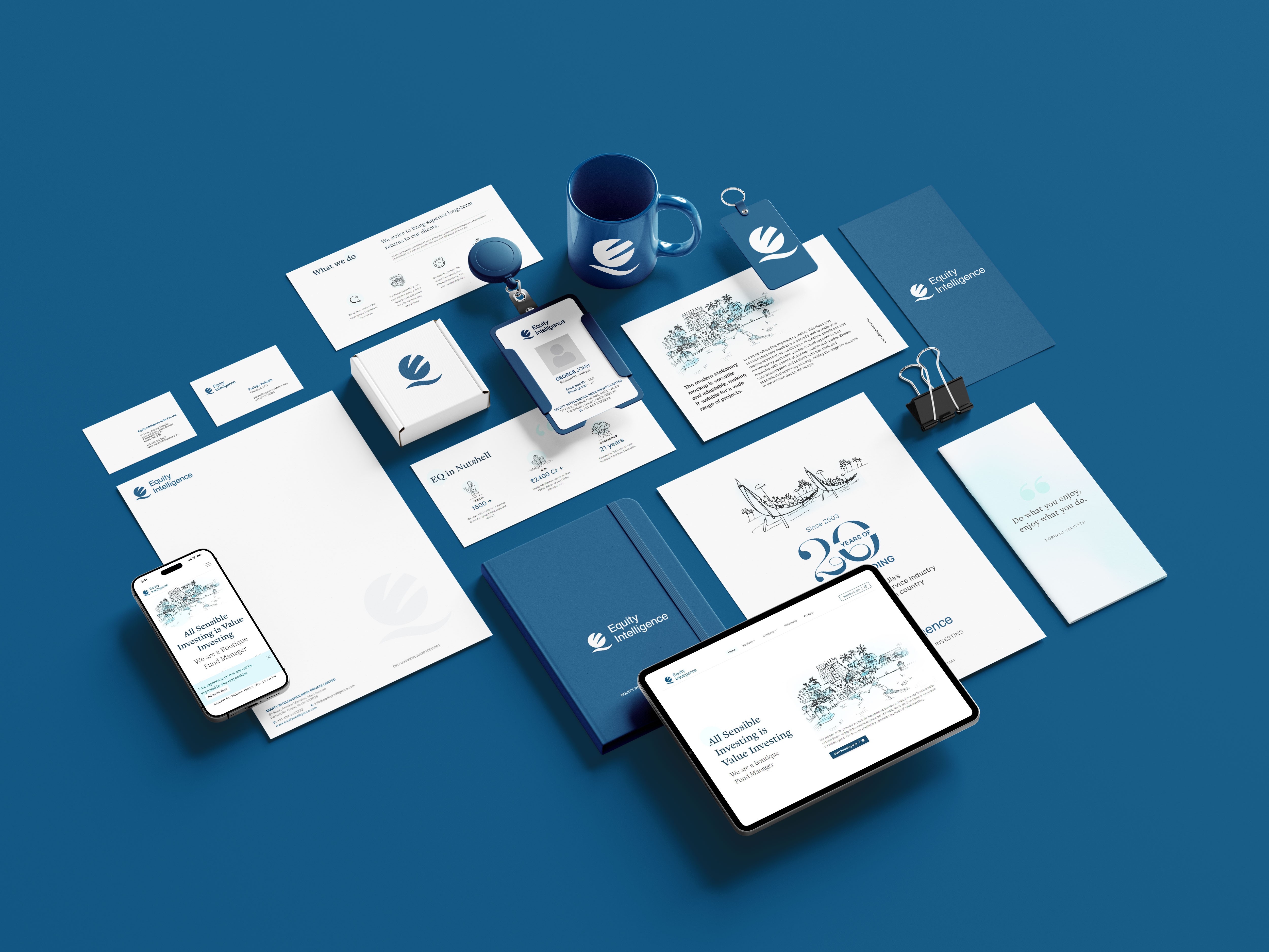
Logo Design: The new logo was inspired by Kerala’s backwaters, symbolizing adaptability and growth. The flowing curves and deep blue tones reflected the company’s long-term vision and trustworthiness.
Illustration: Every illustration, from the Padmanabhaswamy Temple to Kerala’s architectural details, was crafted to reflect the firm's values of wealth protection, strategic growth, and trust.
Color Palette & Motifs: We chose a color palette that reflected Kerala's natural beauty and historical wealth while conveying modern professionalism. Deep blues were used to symbolize stability and trust.
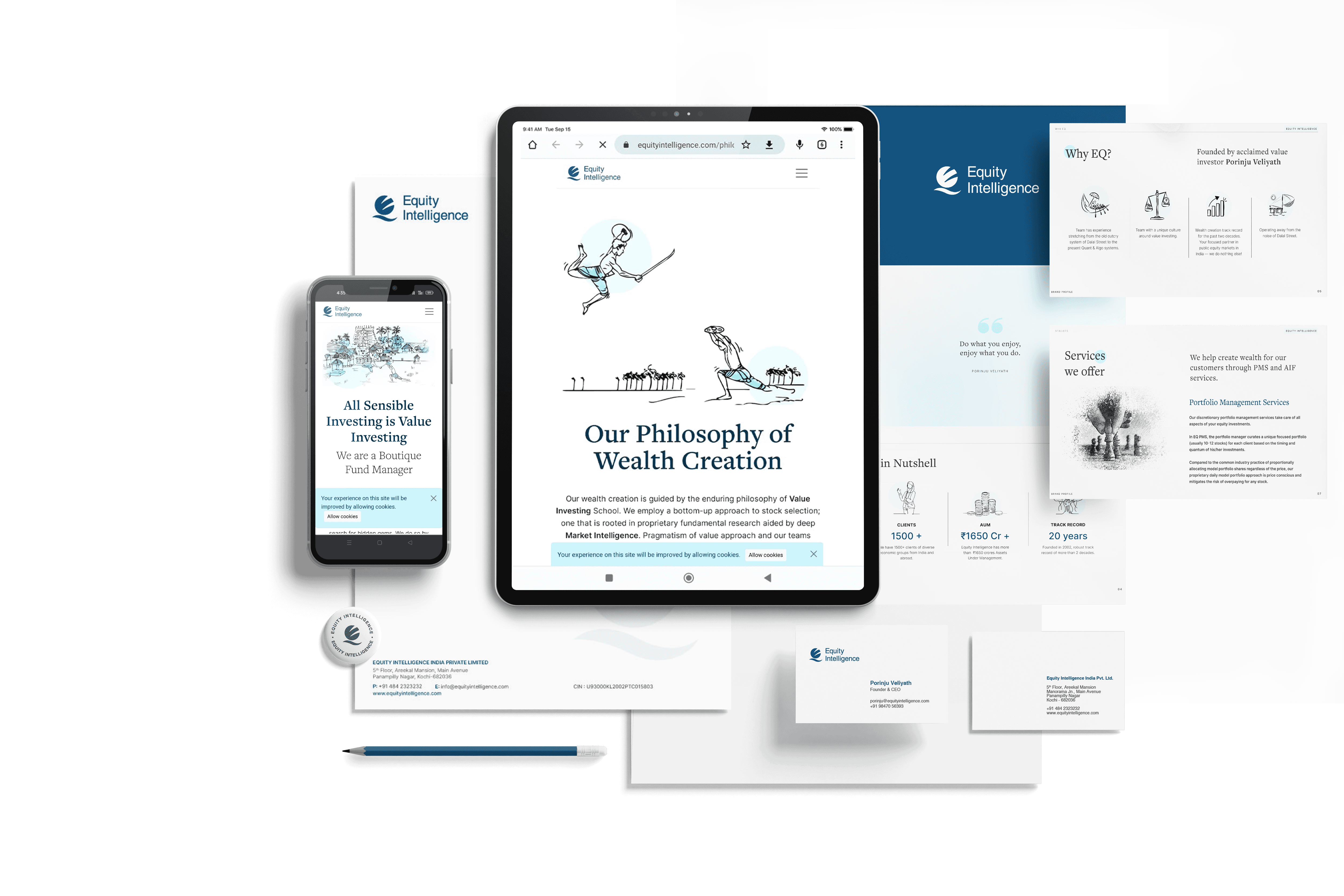
Web Design: The website combined interactive content with a seamless blend of Kerala's traditional elements and modern user experience principles. The design ensured the content was relatable to both local investors and a national audience
Detailing the creative and technical work involved in executing the project. From design to implementation, this section showcases the steps taken to bring the vision to life.
Our rebranding project for Equity Intelligence India followed a meticulously planned, multi-phase process designed to ensure a seamless brand transformation. Each phase contributed to creating a cohesive identity that reflects the firm’s Kerala roots while positioning it as a modern, national financial brand.
1. Brand Identity Development
The first step was developing a brand identity that would tell a compelling story. We collaborated closely with Equity Intelligence India to craft an identity that wove Kerala’s cultural heritage into every element. From the flowing curves of the logo—representing Kerala’s iconic backwaters and symbolizing adaptability and growth—to the rich color palette inspired by the region’s natural beauty, every design choice reflected the company’s values of stability and long-term vision. Our aim was to create a visual language that not only celebrated tradition but also spoke to a modern, nationwide audience.

2. Hand-Drawn Custom Illustrations
Illustration played a key role in the storytelling aspect of the rebrand. Each illustration was carefully hand-drawn to symbolically represent Kerala’s heritage. For instance, the Padmanabhaswamy Temple—a symbol of immense wealth and historical significance—was integrated to reflect the firm’s focus on wealth protection and trustworthiness. These thoughtful, culturally rooted illustrations helped deepen the emotional connection with the brand, ensuring it resonated with both local and national stakeholders.

3. Website Redesign
The website redesign was a critical component of the rebrand. We focused on creating a clean, modern interface while integrating Kerala’s traditional elements. The goal was to build an engaging and intuitive user experience that would reflect the firm’s values of trust, stability, and long-term growth. The new website features personalized icons, interactive content sections, and a seamless blend of modern design with timeless investment principles. This created a unique experience that connected with investors on both a practical and emotional level.

4. Stakeholder Engagement
To ensure the new brand resonated with key audiences, stakeholder feedback was an integral part of the process. We involved both local and national investors, adjusting elements of the design based on their insights. This helped align the brand with the values and expectations of its diverse audience, ensuring that the rebrand wasn’t just visually appealing but also strategically sound.
5. Market Rollout
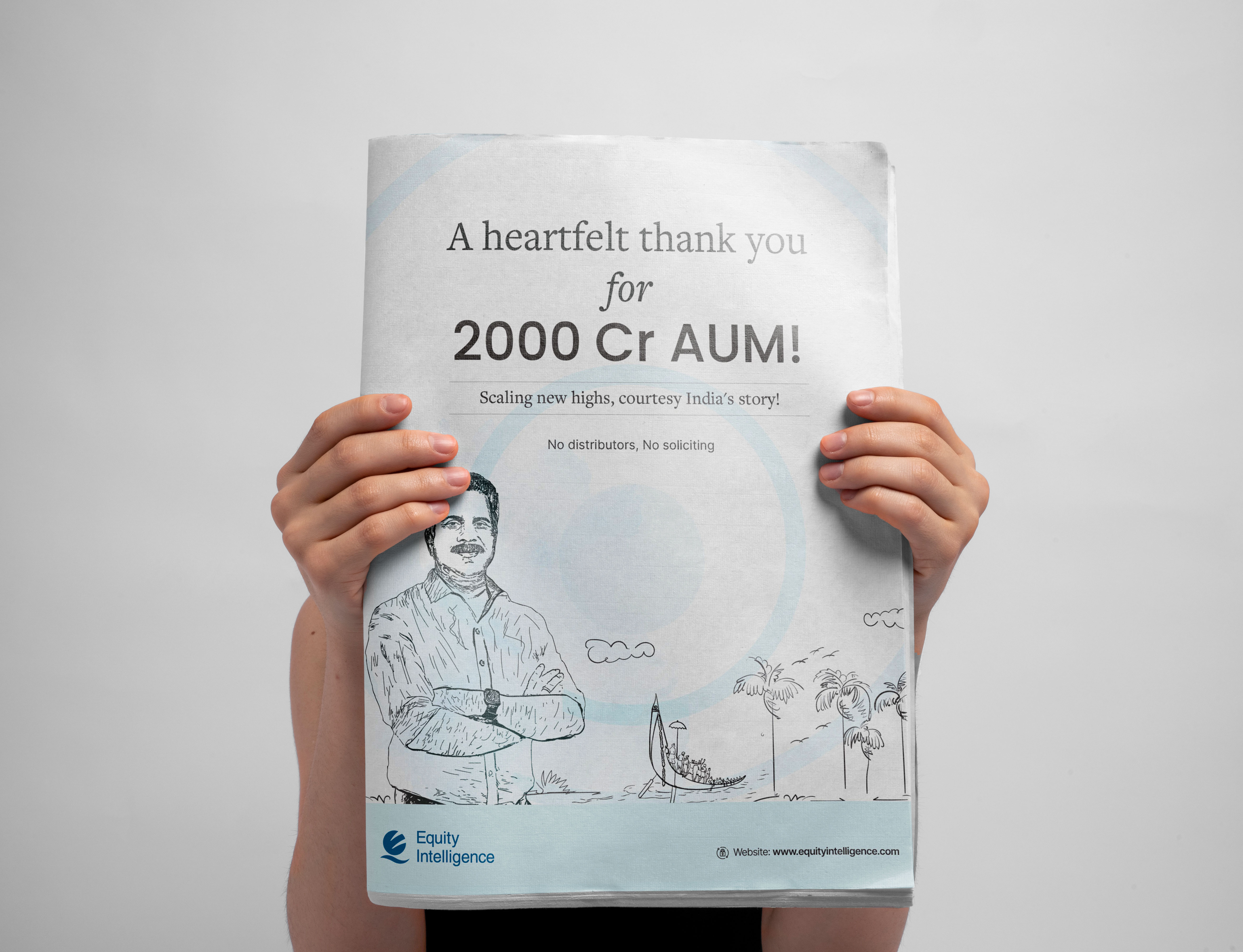
Once the brand identity and digital assets were finalized, we launched the rebranded Equity Intelligence identity across all digital platforms. The rollout was carefully planned to maximize engagement, leveraging the new identity to strengthen the firm’s positioning in both local and national markets. The response was overwhelmingly positive, with enhanced brand visibility and a significant increase in audience engagement.

Summarizing key takeaways and reflections from the project. This section highlights lessons learned, overall project outcomes, and the value provided through our approach and solutions.
The rebranding of Equity Intelligence India was a success, positioning the firm as both rooted in tradition and forward-thinking. The project helped enhance visibility, engage a wider audience, and create a cohesive visual identity that aligned with the company’s core values.
Brand recognition improved significantly in both local and national markets.
Stakeholder feedback was overwhelmingly positive.
Engagement times increased by 50%, averaging 99 seconds per session.
We thank Equity Intelligence India for the opportunity to work on this transformative project.
If you’re looking to create a culturally rooted yet modern brand identity like Equity Intelligence India, contact us to bring your story to life.
